How I made this site
Feb 10, 2025
You’d be forgiven for thinking creating a personal site is just an exercise in vanity. While I wouldn’t deny this partial truth, if done right, crafting a personal site, can be much more. In fact, I’d go as far as to say there are few activities in this world as deeply reflective and therapeutic.
In a society of vapid LinkedIn profiles and keyword-optimised resumes, in a society where our real and digital identities become less discrete by the minute, having a little corner of the world that shows who you are, who you really are, is a necessary anchor to stop you devolving into the vacuous LinkedIn posts you write. Believe me, I’ve seen it happen, once gregarious friends now insert the words ‘synergies’ and ‘cost-benefit’ into their pub-talk lexicon.
This is only the second time I’ve created a personal site, both times I’ve done it at that exciting, but often unsettling period between closing a past chapter and embarking on a new one. You can, of course, create your personal site at any time, but if you are at a crossroads, I find the process can help lift the fog on what’s next.
If you are at such a junction, or just feel your identity being pulled by the thralls of anodyne corporatism, I hope this article will give you some motivation to create your own personal site. While this won’t be an in-depth how-to guide, I’ll be giving some tools on how to approach and execute your build, in this world of no-code tools, creating something great is easier than ever.
The whispering of a personal site
All personal sites whisper, some more discreetly than others, something about the creator. Some sites whisper ‘I have taste’, others ‘I am successful’, and others ‘I am smart’. In my experience, this whisper can only come after the site has been created, never before, as you pick the themes, add the copy, the style and the imagery, the whisper will start to manifest. Having your work show you this whisper is the most important aspect of creating a personal site. It tells you who you are, or more accurately, who you are trying to be.
Looking back at the first site, I created, the message was clear ‘I’m a hustler’. Look at all the things I’m doing! I have a blog and a newsletter, I sell products, I have startups. ‘I’m too cool for school’, is another clear whisper, demonstrated by the (only semi-successful) attempts at humour in my copy.
These whispers made sense at the time, I’d left the corporate world for startupland and was desperately trying to build some kind of solo success. Imbibing this new identity into everything I did was required to make that dream a reality. Mankind is the bullshitting animal and at the end of the day, you are the bullshit you tell yourself.

Since selling my last company, I’ve been struggling to find my new narrative. As I mentioned earlier, I don’t think you can skip to the end. I can’t start with the question ‘what do I want this site to whisper’, and I don’t think you can either. The most rewarding part of creating a personal site is getting to this realisation through the creative process.
Here’s that process, and the realisation I uncovered.
Picking an aesthetic
The first thing you need to do is pick an aesthetic. Depending on your level of taste, this will fall somewhere on the spectrum of self-directed and imitation.
My past site made use of different design elements, colours and images. I wanted my new iteration to have a paired-back look, letting the copy speak and not distracting the viewer with anything superfluous. Structurally, I loved Brian Lovin’s personal site, which had everything organised in the style of a note-taking app. I thought this was pretty timeless, and also made navigating stuff simple.
I think for most people, your best bet is to model your personal site on 1-3 sites you’ve found that you like. For inspiration, you can just google ‘personal site examples’.
Choose your weapon
Unless you know how to code you should use a no-code website builder. To be honest, even if you know how to code, unless there’s something super custom you want, or you want to stroke your ego by flexing a new framework of language you haven’t used much before (no shame), a no-code builder is nearly always the way to go.
My weapon of choice is always Framer. Framer is a no/low-code website builder that, in my eyes, is in a class of its own. I used to use WebFlow, but I find Framer to be much more simple, the user experience is based on Figma, so if you have a design background you’ll find Framer very simple to get going with. If you have no design background the learning curve may be a little steeper, but they have a tonne of ways to make it easier, also being able to spin up a website in a few hours is a skill that would benefit pretty much anyone.
Another great thing about Framer is its template store. I’m always one for making life easy, so I found a Framer template made by Cedric that was pretty similar to Brian’s site structurally.
The main advantage I find with using templates (behind the time saved) is that they are constructed by people like Cedric who really know what they are doing in regards to components and scalability. If I create my own site I always end up having font/sizing inconsistencies, due to my (now no longer cute) habit of rawdogging everything. When using a template everything is neatly categorised so you just need to edit the master component and see everything reflect that master at once.

The template I started with
Building the base
Once you’ve got your base, whether that be a purchased template, a default template on your no-code builder, or if you’re feeling maverick, a blank sheet, you need to get the foundations laid.
In my case, the main thing the template was missing was a secondary side navigation, which I needed for my articles. This was quite complicated, to be honest, and was the most time-consuming element of the whole site. If I can get this into a useable form I might share this as a template.
Creating the secondary side navigation to host articles and notes was a bit of a bitch.
The only other bit of custom code I did on the main site was making the greeting on the homepage dynamic. I got chatGPT to write the code and created three separate components for morning, afternoon and night. It worked first time. Anyone who tells you that ChatGPT can’t code is lying to you.

The rest of the alterations were mostly via negativa. There was a lot of superfluous stuff that I didn’t really think added anything so I pared it back (often templates index on including too much). I changed things like the fonts (my preference is serif) and some of the colours until I had a base I was happy to work with.
Hero section
A personal site should encourage you to take some kind of action, it shouldn’t be some relic that just sits there at a static point in time. A personal site should also have one clear focus. This was a mistake I made with my past site, trying to do too much. The mistake wasn’t with the site design, but my mind, the personal site simply revealed that to me, albeit 5 years later.
I’ve always loved writing, but like most, sometimes found it hard to stay consistent. I want to take writing more seriously over the coming years, if anything it helps me think better. I want this new site to motivate me to write more consistently, but mainly to write better.
The great thing about Framer is it almost completely eliminates the friction of putting an essay from a Notion doc, newsletter tool or wherever else you craft your writing to a personal site. My writing section is just a simple CMS. I opted to not include title imagery for my articles, doing it in the past I’ve found it difficult to keep a consistent style and it just ends up looking messy.
The only improvement I’m currently looking to make to my writing structure is to enable full-screen mode when viewing articles on desktop (which may or may not be done by the time you are reading this). I’m also in two minds about importing old articles into this site. I suffer from the (I think common) ailment that I think everything I’ve ever written is garbage. My mantra for writing from now on is less but better – I’m not sure I want nonsense written by my 25-year-old self in my new improved mind palace.
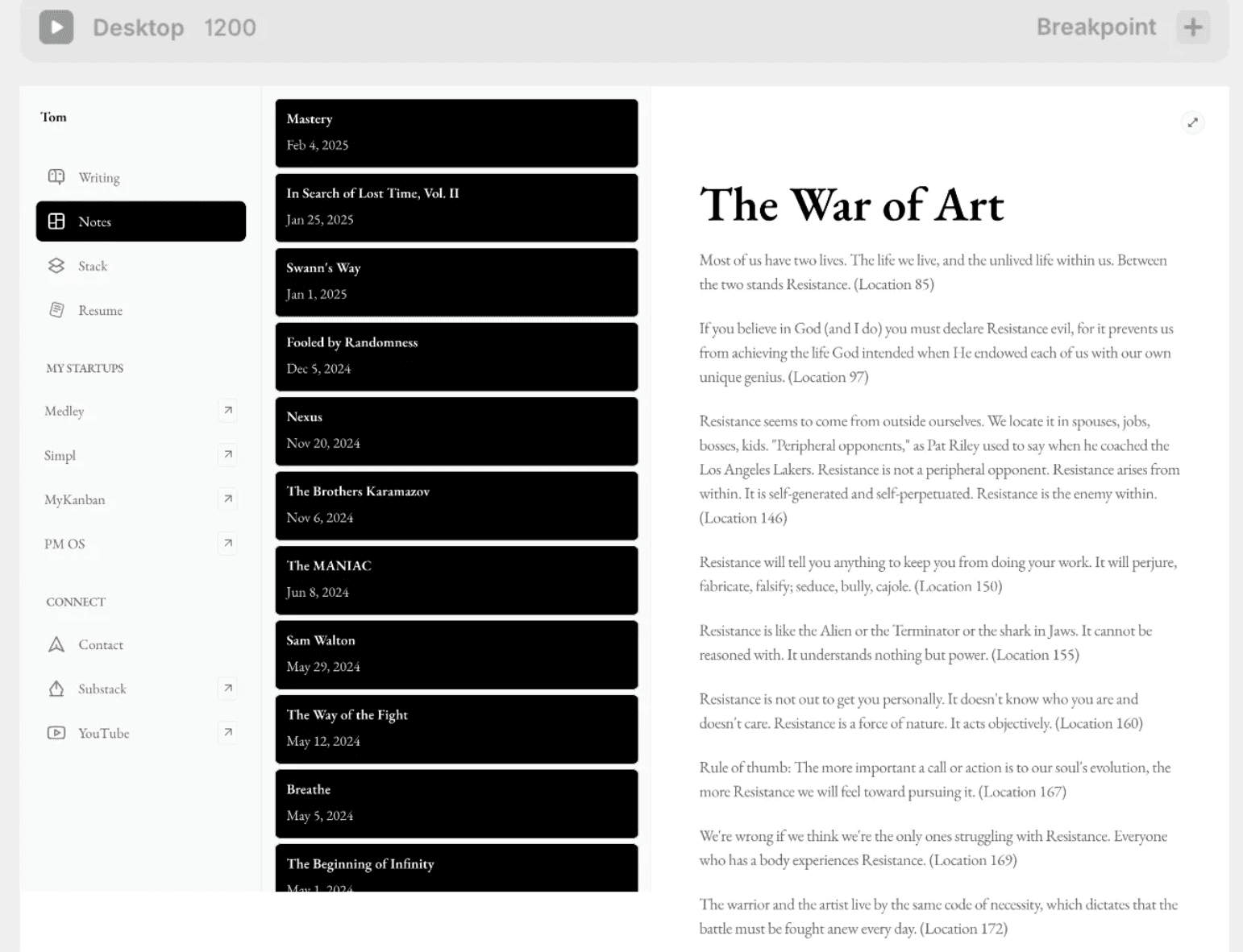
Book notes
As an avid reader, this is probably the section of the site I’m most proud of. Every highlight I’ve ever made on my Kindles over the last five years (bar a period where I foolishly used an ex’s Amazon account) is now viewable on my personal site. There is a technical pride – having every highlight I make automatically sync, with zero effort on my part, is pretty satisfying, but it goes deeper than this.
The saying goes if you want to see someone’s priorities, look at their calendar. If you want to see someone’s values, look at their bank account. I’ll add a new one, if you want to see how someone thinks, look at their book highlights. Highlights, like writing, give people a great insight into how you think, they reveal to the world the prose and opinions that resonate with you, hopefully, there’s a small portion of the readers out there who also find my highlights resonate with them, now we have a shared connection – this is what a personal site is about.
This section was set up with zero code, using Readwise, Notion and Framer. Readwise is a service that essentially acts as a structured database for your Kindle highlights, another perk of the app is that it sends you an email every day with a selection of your past highlights. It’s not the cheapest service, for me it’s worth every penny.
Readwise now has a native integration with Notion, simply create a Notion database and you can sync it with Readwise to store each book as a page, with the highlights being the contents of that page. Framer’s CMS also conveniently offers a Notion integration, which can sync with any Notion database, using the content of the database to populate the CMS.
I never set out with the intention of including all my book highlights for the public to devour. The fact I have has revealed something to me. Reading is a staple of my life and something I want to bring with me, and even double down on, in my next chapter. This realisation may not have come about if I hadn’t gone through the process of creating a personal site.
Other bits
I decided to include a (slightly altered for the public) resume. I’m not sure why you wouldn’t, you never know who is looking and having an easy way for people to see your experience could lead to some interesting opportunities. I used one of these Figma templates for my resume and then copy pasta’d it into Framer, I neatened it up to make sizes etc. consistent with the rest of the site but the whole process probably only took 30 minutes.
I also have a Stack section, showing the tools I use. I might get rid of this, most of the stuff I use is quite generic and I don’t think it adds too much to the overall experience.
Finally, I have a link to all my startups, I guess this is my ‘portfolio’. I also included an easy ways to contact me.
Future improvements
At the moment I’m fairly happy with how the site has turned out. I think if I make any changes it will be with the motivation to inject a bit more personality into the site. I quite like the idea of sharing a few photos, jiu-jitsu videos, motorbike adventures, sartorial things or maybe even the framework of a book I’m considering working on. All these improvements will be led by things I want to do and I want to share, I’m not really interested in making money from this site through the sale of products, it’s a passion project.
I’ve recently inherited the unfortunate affliction of a motivation to start YouTube again. It might be cool to convert my writing into very high-quality video essays, my idea is to have a tab on each article to swap between seeing it as a written piece or in video format.
Cost
Because I’m using an all-in-one platform to build and host this site, I only really have one cost, which is Framers’ £30/month fee. I also pay the domain subscription via Namecheap but that's less than £40/year. I guess you are looking at £400/year. I suppose I also had the one-off cost of around $100 for the Framer template.
I’m on Framer’s Pro plan because the site uses a lot of different CMS’ (one for writing, one for book notes and one for Stack). If you only need 2 CMS’ it’s £12/month and none is £4.
Of course, the biggest cost saver of using a no-code tool is the time saved. I reckon if you were to code this from scratch, you’d either be paying a developer low thousands, or taking a tonne of time to do it yourself.
Zooming out
Looking at the site with fresh eyes it’s clear I’m not in this pure hustle mindset anymore of my first website. I’ve achieved some kind of success doing what I was faking on my first personal site. If I had to sum up what my new site whispers it would be ‘quiet confidence’, I’m not saying this was a conscious choice, but looking at the site now this is what is spoken to me. I’m also not saying that’s how I feel about myself, that’s not the point, creating a site reveals the story you are telling, whether it’s accurate to reality or not.
Creating a personal site isn’t just about having an online presence. It’s a way to see yourself more clearly. If you’re at a crossroads or feel adrift in digital noise, start building, it might whisper back more than you expect.